



Hi,
Yes you can absolutely recreate this style in CapCut. The screenshot you shared is actually simpler than it looks.
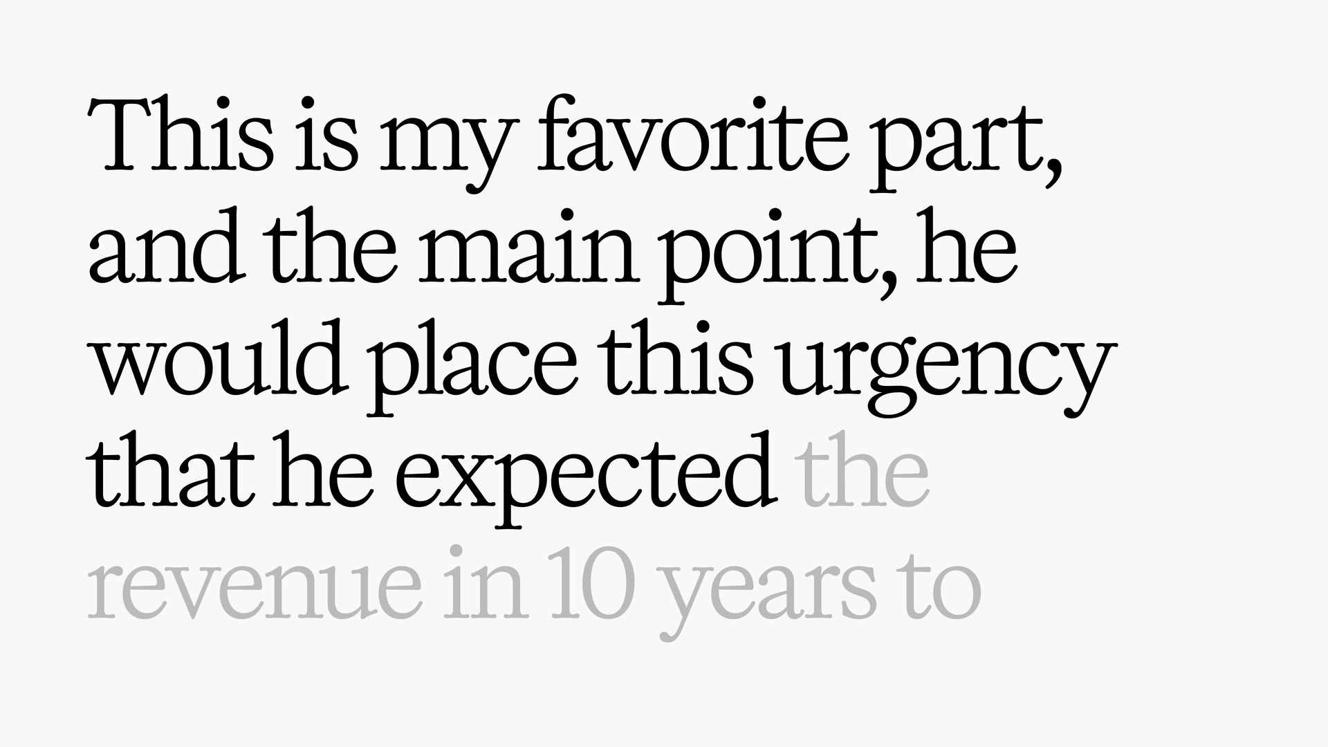
The key effect is not really a typewriter effect. It’s more like progressive text highlighting:
-
The entire sentence is already visible in a light gray.
-
As the narration progresses, the words being spoken become dark/black.
-
The black section moves forward through the sentence.
-
The text stays in a clean serif font, with lots of whitespace.
-
There’s very little other visual clutter.
The YouTube reference you gave is How Elon Works.
The easiest way to make it in CapCut
I recommend using two copies of the same text rather than trying to animate every individual word.
1. Create your background
Use an off-white background rather than pure white.
Something around:
#F7F6F2
or simply choose a very light warm gray/off-white.
2. Add your complete sentence in gray
For example:
This is my favorite part, and the main point, he would place this urgency that he expected the revenue in 10 years to
Make the entire text a light gray, approximately 30–40% opacity.
Use a serif font. Try fonts such as:
-
Cormorant Garamond
-
Libre Baskerville
-
Playfair Display
-
Bodoni-style fonts
-
Times New Roman if you want something simple
I'd start with Cormorant Garamond for a look close to your screenshot.
Keep the text relatively large and let it wrap naturally into 3–5 lines.
3. Duplicate the text layer
Now duplicate that exact text layer.
Change the duplicate from gray → almost black.
Important: Don't change the font, size, line spacing, or position. The two copies need to line up perfectly.
You'll now have:
Bottom layer:
gray entire sentence
Top layer:
black entire sentence
4. Reveal the black layer from left → right
This is the important part.
You want the black version to progressively reveal itself over the gray version.
In CapCut, select the black text and experiment with the available Text Animation / In animations, particularly a wipe/reveal-style animation. CapCut currently has text-reveal and wipe-style templates/effects, so searching for those terms is useful.
If your version of CapCut doesn't give you a suitable text wipe, you can build the reveal using a mask and animate the mask position.
The visual result should be:
Beginning
This is my favorite part, and the main point...
with the beginning black and the rest gray.
Then:
This is my favorite part, and the main point, he would place...
with more of the sentence black.
Then:
This is my favorite part, and the main point, he would place this urgency that he expected...
And so on.
That gives you the exact "spoken words become black while upcoming words remain gray" feeling.
Even easier: split the sentence into chunks
If you're editing on CapCut mobile and the masking method becomes annoying, there's a very easy workaround.
Make separate text layers:
Layer 1
This is my favorite part,
Layer 2
and the main point,
Layer 3
he would place this urgency
Layer 4
that he expected
Layer 5
the revenue in 10 years to...
Set them all to gray.
Then duplicate each one and make the duplicates black.
Put the black versions on the timeline according to your voiceover.
Give each black layer a very short Fade In — around 0.1–0.2 seconds.
That will create a very clean documentary/video-essay style.
CapCut supports text animation presets as well as keyframes for properties such as opacity, position and scale, so you can fine-tune the timing rather than relying entirely on templates.
The timing is what makes this style look good
Don't make the words pop in dramatically.
The animation should be subtle.
For example, if your narration says:
"This is my favorite part, and the main point..."
your timeline might look like:
VOICEOVER
| This | is | my | favorite | part | and | the | main | point |

TEXT
|████████████████████████████████████████████████████████|

BLACK
|█████████████████████████████|

GRAY
                              |██████████████████████████|
As the voice reaches each word, the black region moves forward.
I'd use roughly 0.15–0.3 sec of transition rather than a noticeable animation.
One trick that makes it look much more professional
Don't highlight every single word individually.
Instead, let the black text move forward continuously or in 2–5 word chunks.
That makes it feel like intentional editorial typography rather than karaoke captions.
What about a CapCut template?
Yes. CapCut currently has dedicated collections for Text Reveal, Animated Typewriter, and Typewriter Text Animation templates.
However, I wouldn't use a generic typewriter template for this particular look. Those templates tend to make letters appear one-by-one, whereas your reference is much cleaner: the sentence exists first, and the spoken portion changes emphasis.
My recommended CapCut recipe
| Setting | Try this |
|---|---|
| Background | Warm off-white |
| Font | Cormorant Garamond / Libre Baskerville |
| Text | Large |
| Alignment | Left |
| Normal text | Light gray |
| Spoken text | Near-black |
| Animation | Subtle reveal/fade |
| Duration | ~0.15–0.3 sec |
| Letter spacing | Slightly negative/normal |
| Line spacing | Fairly tight |
| Shadows | None |
| Text box | Wide, but with generous margins |
The biggest thing is the typography, not the animation. The reference works because the font is elegant, the background is almost blank, and the gray→black transition is extremely restrained.