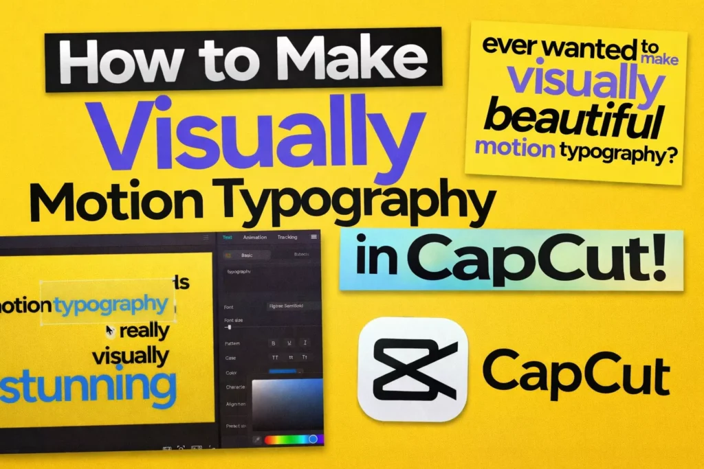
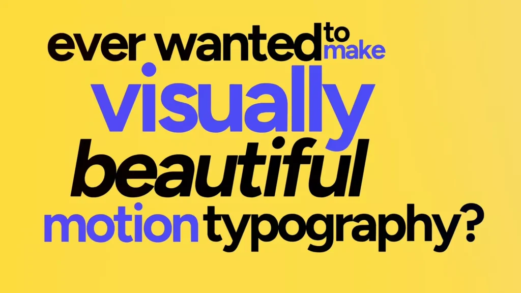
Motion typography grabs eyes everywhere. You see it in TV ads, YouTube clips, and quick explainer videos. It makes simple words dance and pop, turning basic edits into pro-level work.
Good news: you can nail this in CapCut without fancy gear. This guide walks you through every step. You’ll build tracked text that moves smooth, plus killer sound to match. By the end, your videos will look sharp and feel alive.
You can use all the effects and techniques I have shown in the below guide freely using CapCut Pro today.
What Is Motion Typography?
Motion typography (also called kinetic typography) is the art of animating text to visually communicate emotion, rhythm, and emphasis. Instead of static captions, the words move, scale, track, fade, or transform to reinforce meaning.
You have seen it everywhere:
- YouTube ads
- Product explainers
- Trailer intros
- Instagram Reels
- TikTok hooks
The difference between static text and motion typography is energy. Static text informs. Motion typography performs.
When done right, animated text:
- Increases watch time
- Boosts retention
- Highlights key phrases
- Makes simple edits feel cinematic
In short: it turns words into visuals.
Setting Up the Scene: Initial CapCut Project Configuration
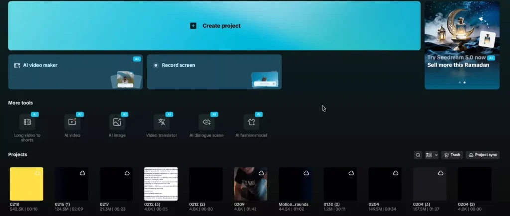
Start simple in CapCut. Fire up a new project. This sets the base for your motion typography magic.
Establishing the Canvas and Duration
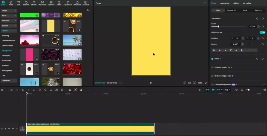
- Head to media, then library.
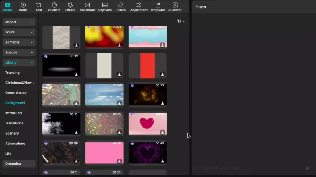
- Pick backgrounds and scroll to the solid yellow one.
- Drag it to your timeline.
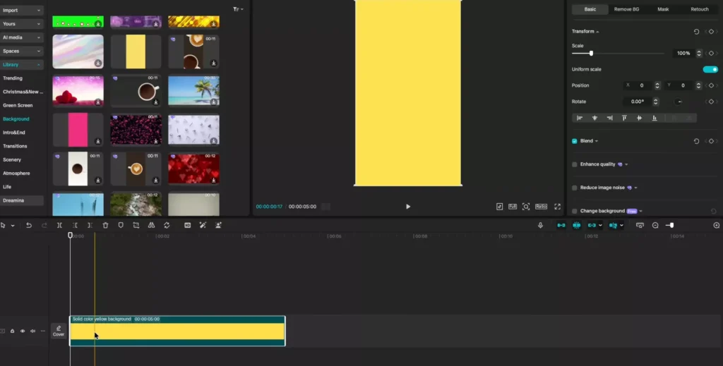
- Stretch it to 10 seconds.
- Match this to your voiceover length.
- More words mean longer clips.
- For shorts or Reels, keep it vertical.
- But flip to horizontal for full videos like this.
This yellow fills the frame nice. It contrasts text well. Play around with other solids too, like black or white.
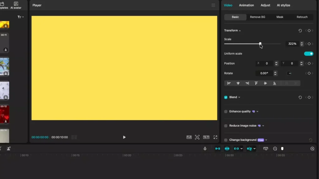
Correcting Aspect Ratio and Background Scaling
Click ratio. Switch to 16×9 for wide screens. Your background shrinks now. Black edges show up. Zoom it in to 322% zoom. Drag till no gaps remain. Perfect coverage every time.
Read Also: CapCut Video Size & Aspect Ratio Calculator (All Platforms)
Test by scrubbing the timeline. No peeks of black. This fix keeps focus on your text.
Solid start for pro motion typography in CapCut.
Crafting the Text Layers: Typography Design and Staggered Entry
Text is the star here. Build layers smart. Make words enter one by one for that wow factor.
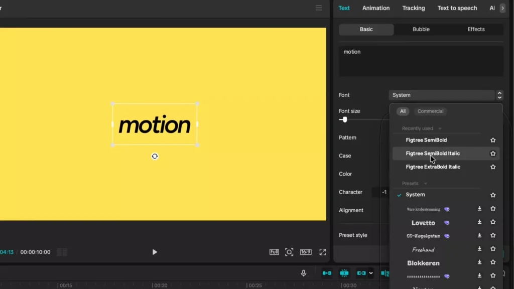
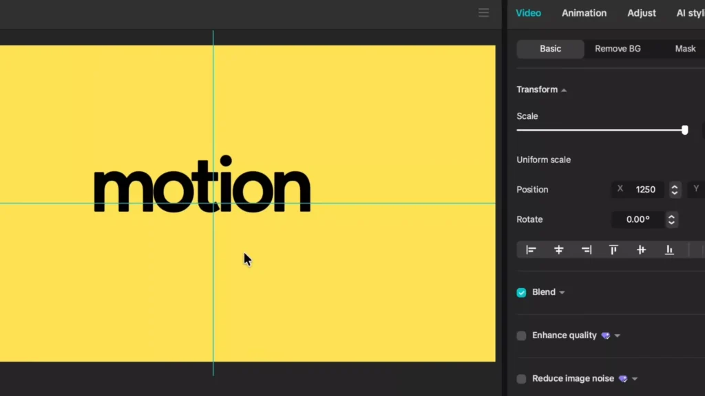
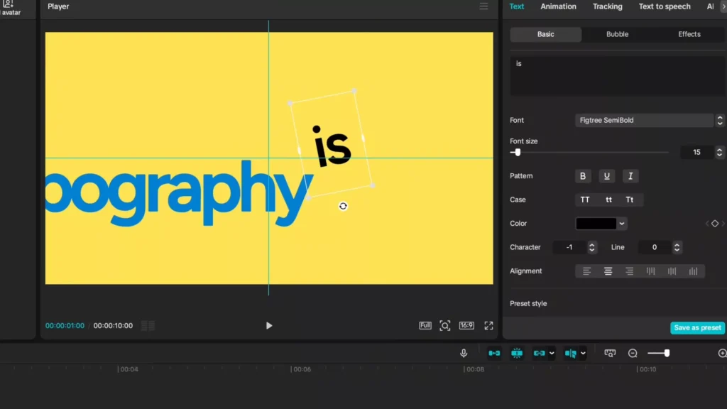
Inputting Text and Initial Styling Adjustments
- Tap text.
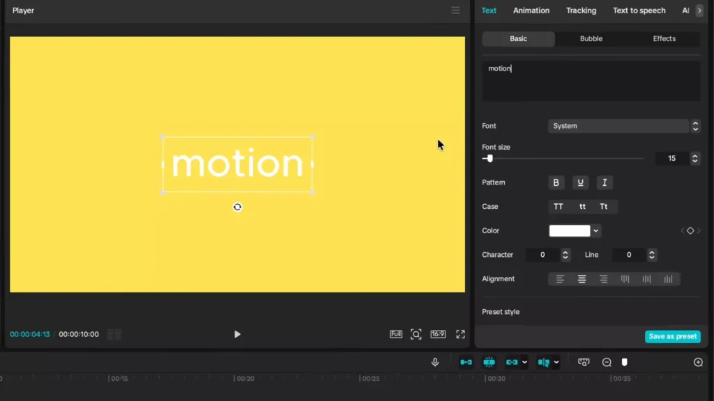
- Add a default layer.
- Stretch it to match your 10-second background.
- Type your first word: “motion.”
- White on yellow looks dull.
- Switch color to black.
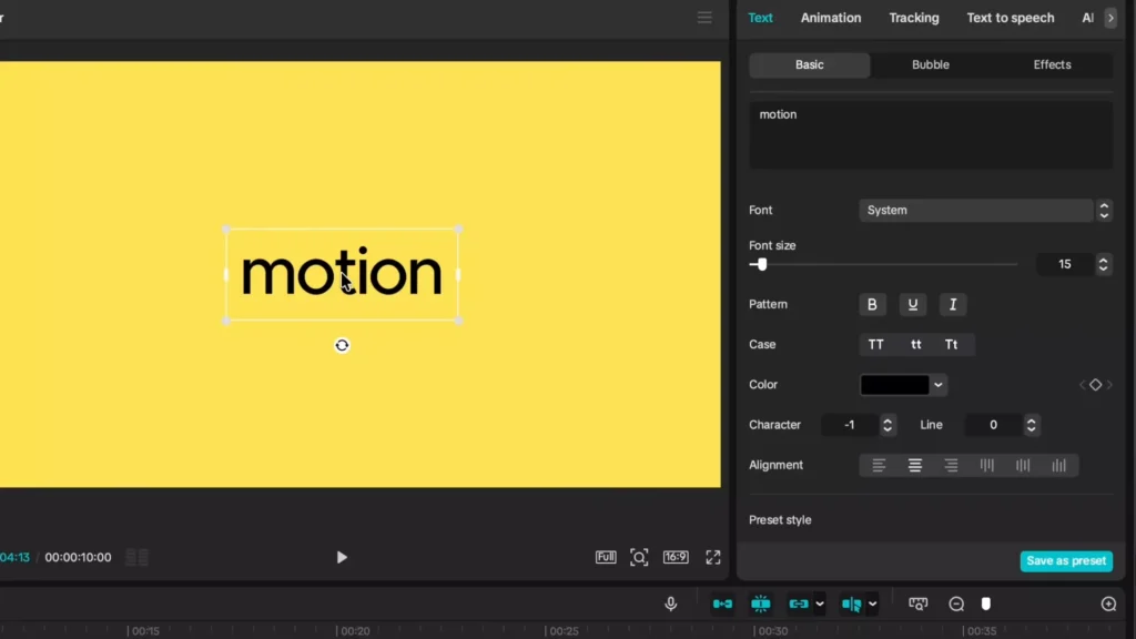
- Go to character.
- Drop spacing to minus one.
- Letters hug closer.
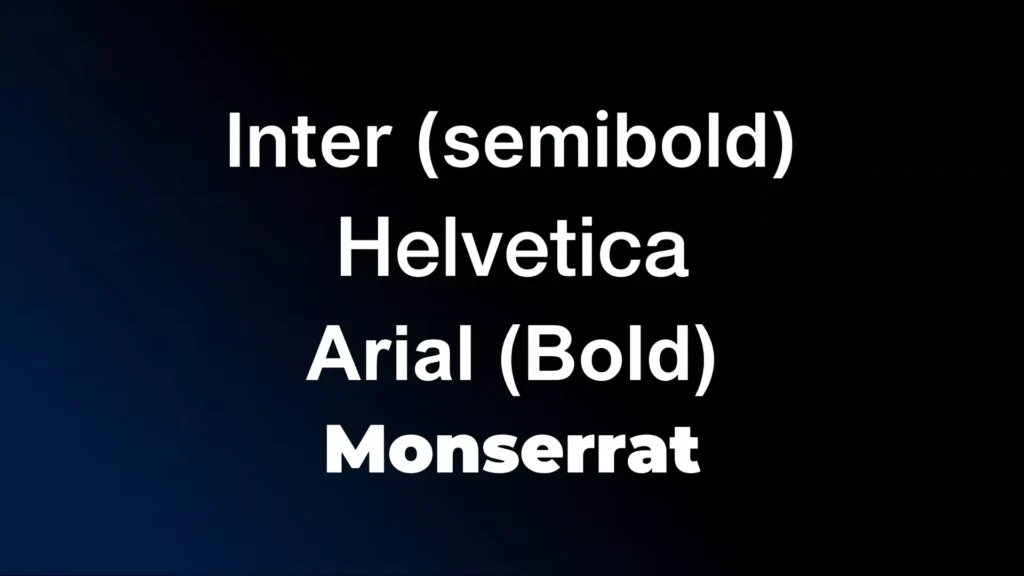
Next, fonts. Click system. Grab Fig Tree semi-bold. Free from Google.
Try Inter or Helvetica too. They shine in motion work. Clean and bold.
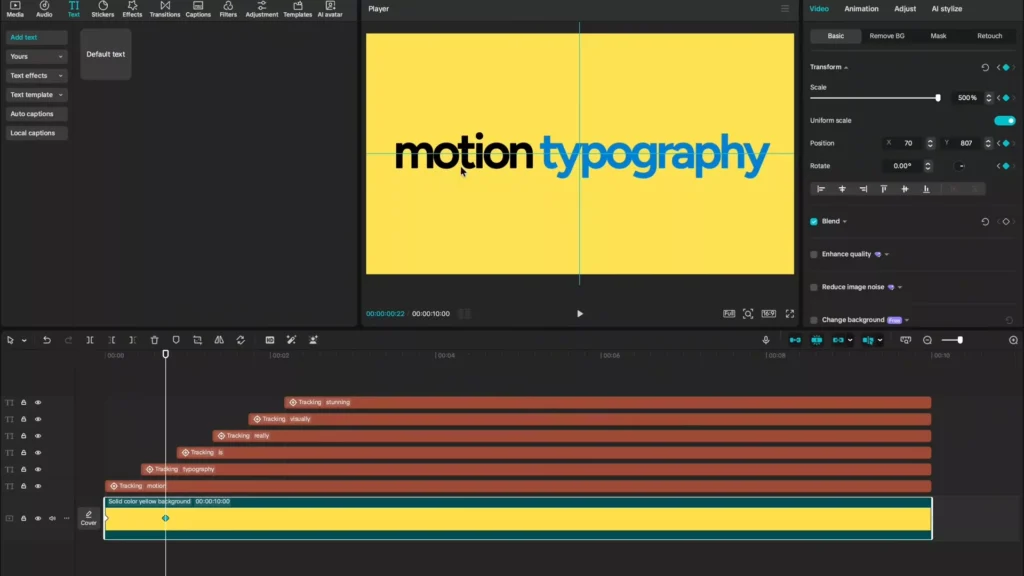
Duplication and Creating the Staggered Timeline
Copy that layer. Ctrl+C (or Cmd+C on Mac). Paste at timeline start. Ctrl+V adds more. Do this for each word. “Motion typography is really visually stunning.”
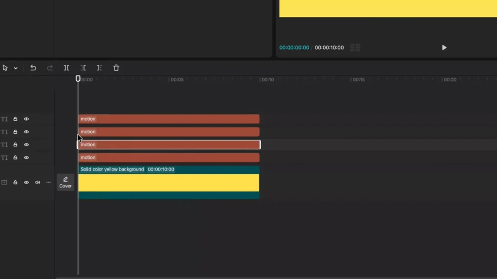
- Scrub to frame zero.
- Hold Shift, right arrow once.
- That’s 10 frames.
- Release Shift.
- Arrow right three times.
- Now at 13 frames.
- Select second layer.
- Hit Q to trim front.
- “Typography” pops in delayed.
Repeat for others. Shift once, then three arrows. Delete “is” if short. Words stagger in. Builds tension fast.
- Shift + right arrow (10 frames).
- Three single rights (3 frames). Total 13.
- Trim with Q.
- Next word same gap.
This timing feels natural. Like words chase each other.
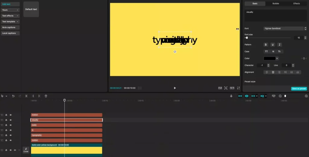
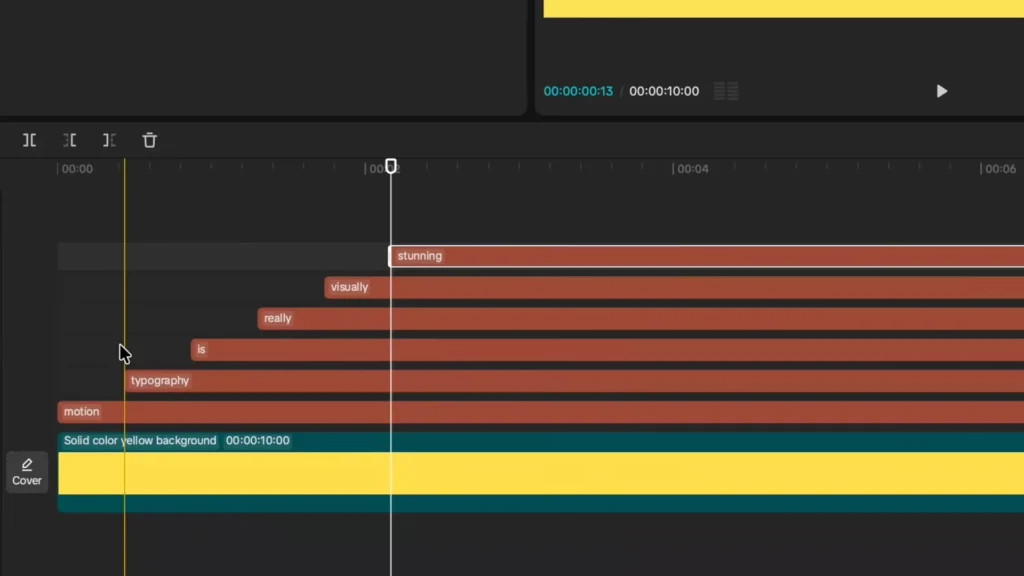
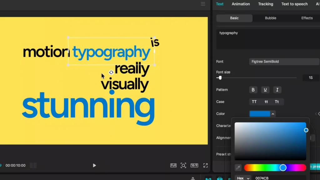
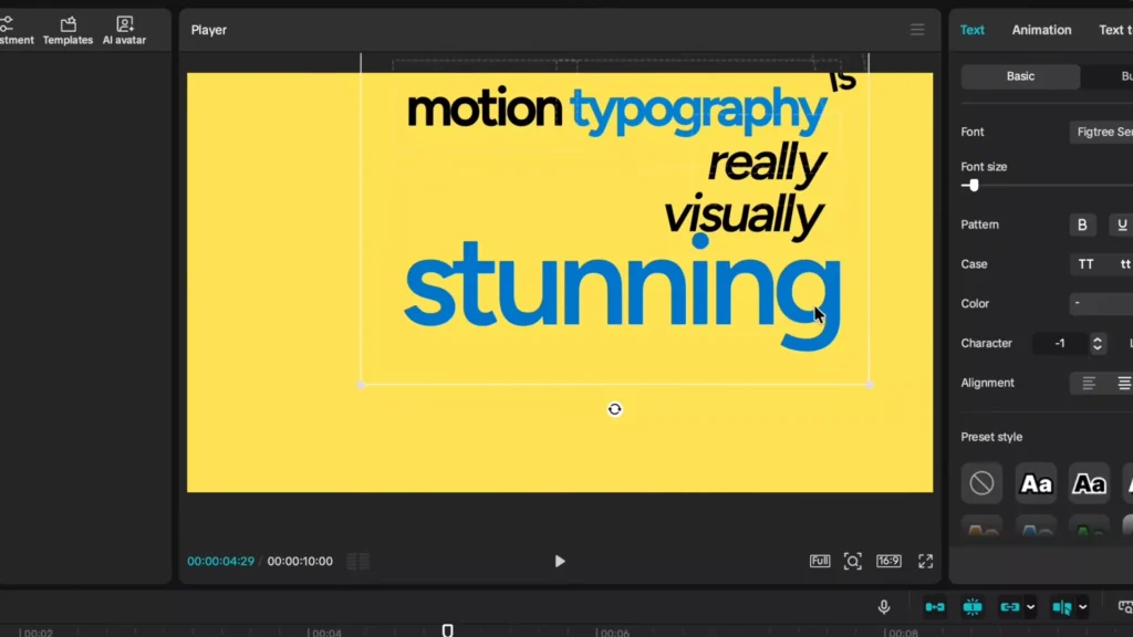
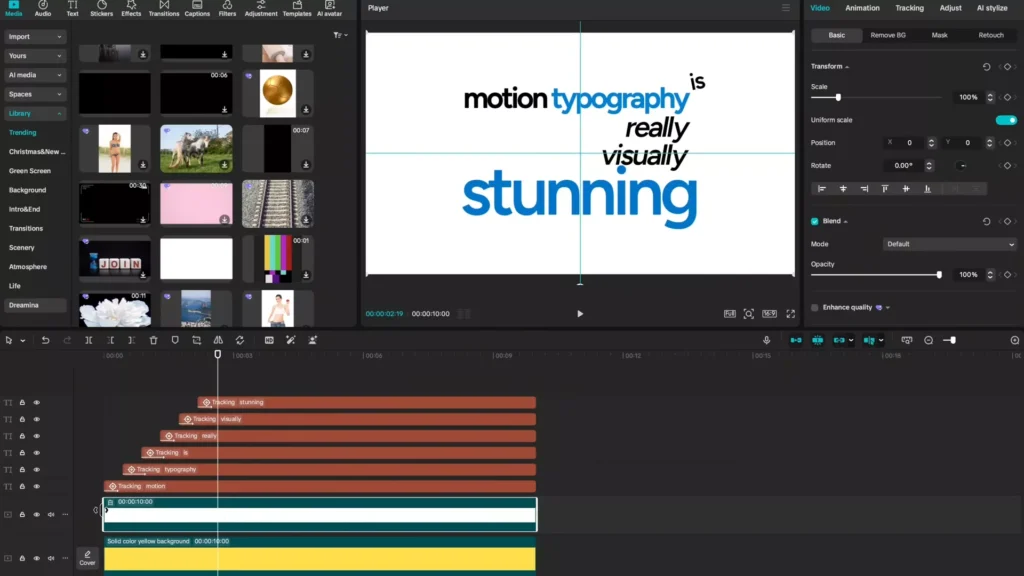
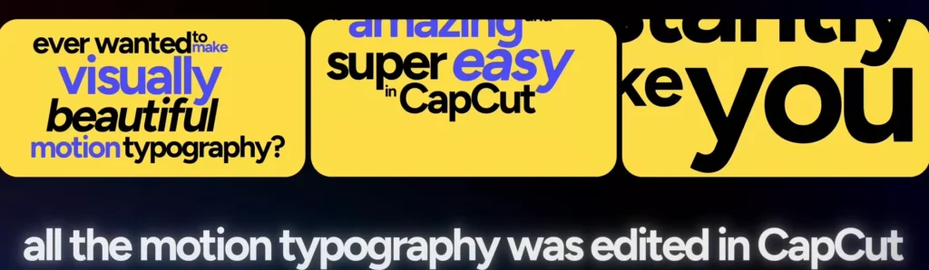
Creative Word Placement and Visual Hierarchy
Click a layer. Drag “typography” next to “motion.” Shrink “is,” rotate it slight. Tuck beside others. Line up Ys in “really” and “visually.” Pump “stunning” bigger. Align its G with “is,” S with M.
No strict rules. Play till it clicks. Highlight all layers. Bounding box appears. Nudge group center.
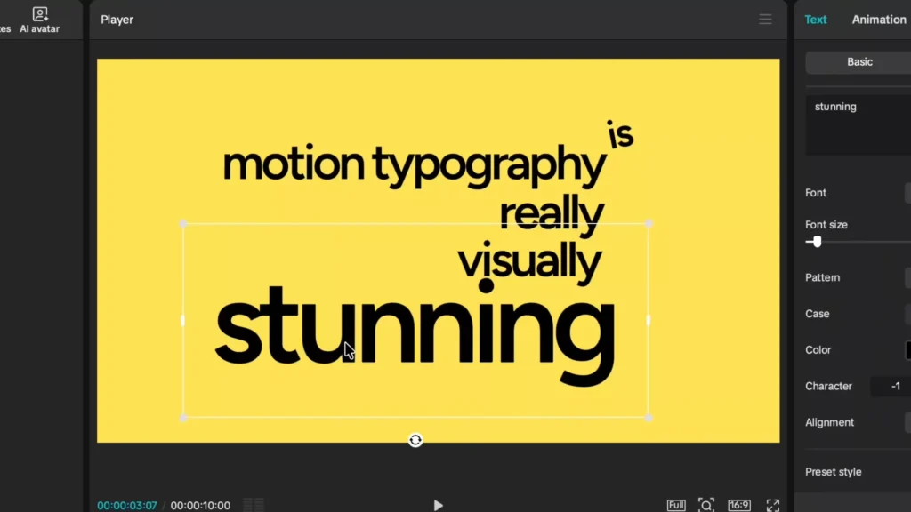
Accent key words. Blue for “stunning.” Eyedropper matches “typography.” Bold motion too. Italics on “really.” Test visuals. Tweak till hierarchy pops. “Stunning” demands eyes.
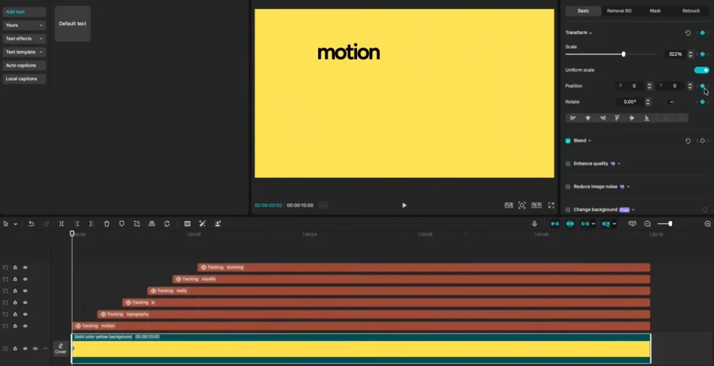
Advanced Animation: Integrating Tracking for Dynamic Movement
Static text bores. Tracking links words to background shifts. They move as one unit.
Utilizing CapCut’s Motion Tracking Feature
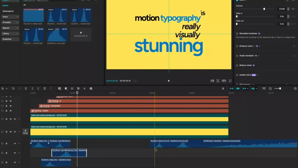
The 2026 update rocks here. Select “motion” layer. Go to tracking. Pick motion tracking. Box pops in viewer. Drag over word. Resize to cover most. Tweak height down. Hit start.
“Tracking completed.” Icon shows on layer. Do every word. “Typography” next. Box hugs letters. Start tracks perfect.
Scrub background. Words follow tight. No drift. Test drag on yellow layer. All syncs.
- Select text.
- Tracking > motion tracking.
- Position box.
- Start.
Locks motion solid.
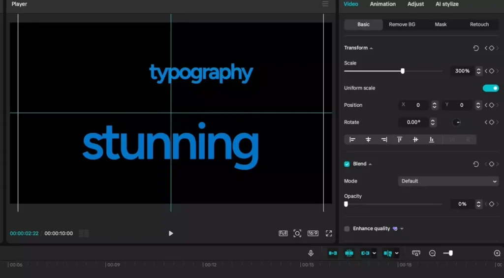
Applying Transform Keyframes for Positional Animation
Playhead at start. Click yellow background. Add transform keyframe. Diamonds appear under scale, position, rotation.
Scale up to 600. “Motion” fills center. Swipe viewer up to push down. Right to center. Inverse drag feels odd at first. Guides help. Add horizontal, vertical lines. Snap perfect.
Sequencing Movement Across All Words
Advance playhead past “typography” entry. New keyframe. Frame cuts off word. Drag in. Drop scale to 500. Both words fit.
Jump to “is.” Keyframe. Scale 800. Center it. “Really” next. Drag center. “Visually” same. “Stunning” last. Scale 300. Pulls all below line. Plays smooth: pop, swipe, expand.
Preview loops it. Motion flows natural.
Polishing the Motion: Smoothing and Final Visual Touches
Jerky? Fix with curves and extras. Pro motion typography glides.
Implementing Speed Ramping with Ease Curves
Right-click yellow layer. Show variable speed animation. Highlight all keyframes. Straight lines go yellow.
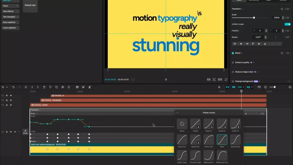
Curves tab. Pick ease for scale. Arrows toggle. Ease X position. Ease Y. Curves bend soft. No snaps.
Hide speed view. Plays buttery. Acceleration, ease out. Huge upgrade.
Layering In-Built Text Animations
Per layer now. “Motion”: fade in, 0.3 seconds. “Typography”: wipe right. Matches swipe. “Is”: clean popup. “Really”: quick fade. “Visually”: fade. “Stunning”: fuzzy zoom. Starts blur, sharpens. 0.3 duration.
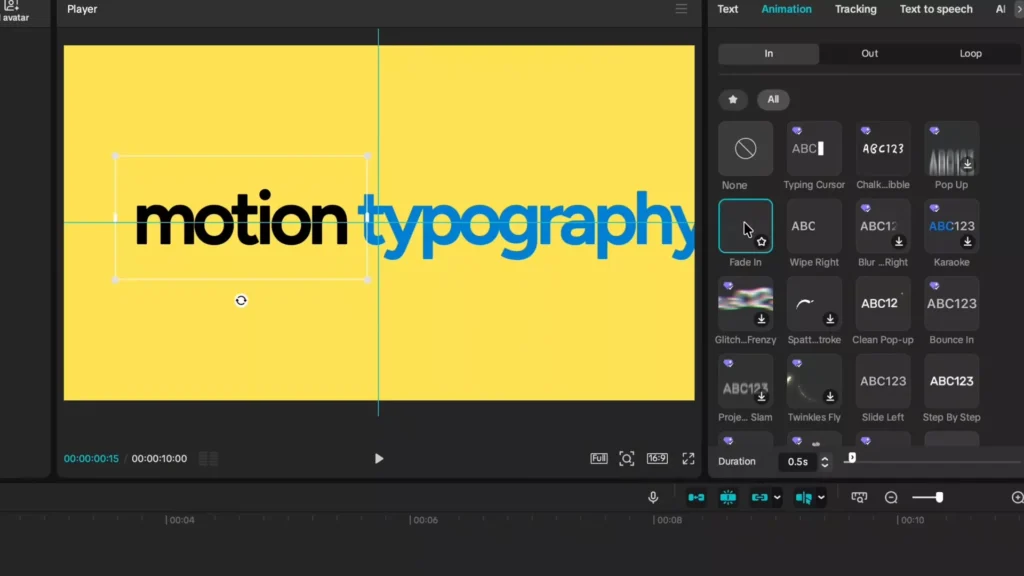
Blends with tracking. Layers pop extra.
Background Flexibility and Final Composition
Yellow gaps show? Blend opacity to zero. Words track invisible base. Import white or custom. Drag above. Stretches same.
Or grab stunning yellow from library. Scale fits. Edges gone. Swap anytime. Keeps motion intact.
The Professional Edge: Mastering Sound Design Synergy
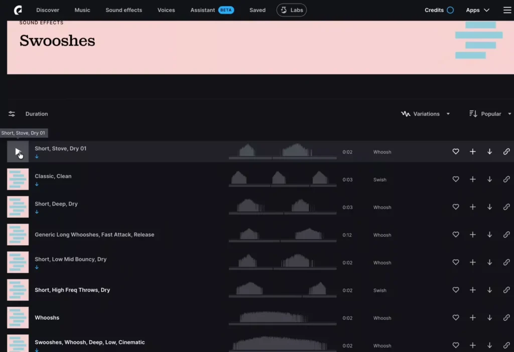
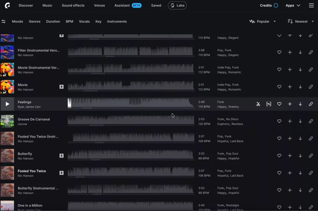
Visuals hit half. Sound nails it. Align hits to moves. Epidemic Sound delivers 50k tracks, 200k effects. Copyright safe. Adapt AI fits lengths.
Aligning Sound Effects to Motion Events
Search swishes. Download whooshes. Import to CapCut. First move at “typography.” Blade, trim, drag snap.
Second whoosh upshift. Third for “really.” End tail on stunning. Transforms feel.
Before: quiet. After: punchy.
- Import effects.
- Blade at motion peak.
- Drag align.
- Preview sync.
Utilizing Risers and Music for Emotional Impact
Risers build hype. Find one. Import under. Trim to end at stunning. Add crossfade. Tension peaks.
Music: funk like “Feelings.” Matches energy. Two minutes total. Sequence lives.
Before sound: flat. With it: pro.
Plan Before You Animate (Pre-Production Strategy)
Before opening CapCut, take 5 minutes to plan.
This separates beginner edits from professional ones.
1. Tighten Your Script
Short sentences work best. Long paragraphs kill motion pacing.
Break ideas into punchy phrases.
Bad:
Motion typography is a visual technique that can improve engagement.
Better:
Motion typography.
Drives engagement.
2. Highlight Power Words
Choose 1–2 words per sentence that deserve emphasis.
Those get:
- Bigger scale
- Color change
- Stronger animation
- Sound hits
3. Decide the Emotion
Your animation style should match tone.
| Mood | Animation Style |
|---|---|
| Energetic | Fast scale + sharp whooshes |
| Dramatic | Slow zoom + riser |
| Clean/Corporate | Subtle fade + smooth easing |
| Playful | Bounce + elastic ease |
Planning emotion prevents random animation choices.
Typography Rules That Make Motion Look Professional
Most tutorials teach buttons. This teaches design.
1. Visual Hierarchy
Not every word deserves equal attention.
Make important words:
- Bigger
- Bolder
- Different color
- Animated more dramatically
If everything moves big, nothing feels important.
2. Limit Fonts
Stick to:
- One primary font
- One accent font (optional)
Clean sans-serif fonts work best for motion:
- Semi-bold or bold weights
- Avoid thin scripts
- Avoid decorative fonts for kinetic edits
3. Use Contrast
High contrast = readability.
Yellow + black
White + black
Dark background + light text
Low contrast kills impact.
4. Give Text Space to Breathe
Don’t crowd the frame.
Negative space makes motion feel intentional.
5. Match Animation to Meaning
Fast swipe = urgency
Slow zoom = importance
Blur-to-sharp = reveal
Animation should support the word’s message.
7 Motion Typography Mistakes Beginners Make
Avoid these and your edits instantly improve.
1. Over-Animating Every Word
Too much movement overwhelms viewers.
2. No Ease Curves
Linear keyframes look robotic. Always use easing.
3. Poor Sound Timing
Whooshes must hit on motion peaks.
4. Too Many Fonts
Three or more fonts looks messy.
5. Weak Contrast
Text must be readable instantly.
6. Ignoring Frame Timing
13–15 frame stagger timing feels natural.
Random gaps feel awkward.
7. Overcrowded Layout
Let key words breathe.
Advanced Motion Typography Techniques
Once you master tracking and keyframes, try these:
1. Parallax Background Motion
Move background slower than text for depth.
2. Masked Text Reveals
Animate a shape mask sliding across text.
3. 3D Fake Camera Moves
Use scale + position shifts to simulate push-ins.
4. Text Blur Transitions
Blur outgoing word as next sharpens.
5. Glitch Emphasis
Use subtle glitch on dramatic words.
These techniques elevate simple edits into cinematic sequences.
How to Turn This Into a Reusable CapCut Template
If you create multiple Shorts, save time.
Step 1: Keep Keyframes
Duplicate project instead of starting fresh.
Step 2: Replace Text Only
Keep animation structure intact.
Step 3: Save Animation Presets
CapCut allows text animation presets — reuse your fades and wipes.
Step 4: Build a “Master Typography Project”
Create one file with:
- Pre-built stagger timing
- Tracking already configured
- Sound markers aligned
Now you only swap script and background.
Huge workflow upgrade.
Best Export Settings for Motion Typography in CapCut
Export quality affects professionalism.
For YouTube (Horizontal)
- 1920×1080 (1080p)
- 60fps if movement heavy
- High bitrate
- MP4 format
For Shorts / Reels / TikTok
- 1080×1920 (Vertical)
- 30fps is fine
- High quality compression
Avoid:
- Low bitrate
- 720p exports
- Heavy compression
Clean motion needs clean rendering.
How to Keep CapCut Running Smooth
Motion typography can lag if layered heavily.
Fixes:
- Use proxy media for large files
- Close background apps
- Avoid editing in 4K if unnecessary
- Shorten timeline segments
- Pre-render preview when needed
Smooth software = smoother creativity.
Frequently Asked Questions
How do I track text in CapCut?
Select the text layer → Tracking → Motion Tracking → Position box → Start.
Does motion tracking work on mobile?
Desktop offers better precision. Mobile works, but less accurate.
How many keyframes should I use?
Only when movement changes. Don’t over-keyframe.
Why does my tracking drift?
Tracking box too small or background lacks contrast.
What fonts work best?
Bold, clean sans-serif fonts perform best in motion.
Practice Exercise: Try This Now
Use this script:
Stop scrolling.
This changes everything.
Watch closely.
Animate:
- “Stop” with aggressive scale
- “Everything” large and centered
- Add riser ending on “closely”
Limit yourself to:
- Two fonts
- One accent color
- Three sound effects
This builds control.
Conclusion: Key Takeaways for Motion Typography Mastery
You got the flow: setup canvas, stagger text, track motion, smooth curves, layer anims, swap backgrounds, sync sound. Tracking plus ease makes it fluid. Sound design seals pro vibe.
Practice this in CapCut. Hits 2026 standards easy. Try on your next short or ad.