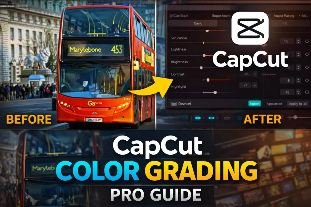
Imagine turning a dull, flat video into something that pops off the screen. That’s the magic of color grading in CapCut. One quick pass through these tools lifts your footage from amateur clips to pro-level work that grabs eyes and holds attention.
Color correction fixes bad lighting and wonky tones right away. It sets the mood—warm for cozy scenes, cool for tense ones. Without it, even great shots fall flat. Pros swear by it; studies show viewers stick around 30% longer for videos with sharp, balanced colors.
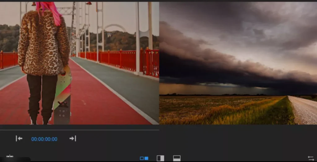
CapCut makes this easy with its clean interface. You start by loading your project. Zoom the timeline with Ctrl and your mouse wheel. Soon, you’ll tweak footage like a boss.
Section 1: Preparing Your Footage and Accessing Adjustment Tools
Timeline Setup and Workspace Optimization
- Get your workspace right first
- Open CapCut and load the project
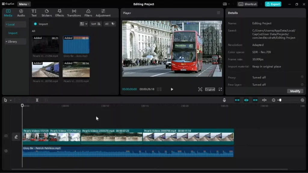
- Hit Ctrl plus mouse wheel to zoom the timeline
- This lets you see every detail without squinting
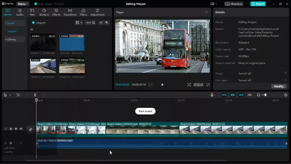
Expand the tracks if needed. Spot extra columns? Mute audio tracks you don’t want. Now focus stays on video clips alone. Clean view means faster edits.
Pro tip: Save this layout. It speeds up every session. Your eyes thank you later.
Locating the Core Adjustment Panel
Click any clip in the timeline. Boom—the right panel lights up with options. Scroll down to “Adjustment.” That’s your color command center.
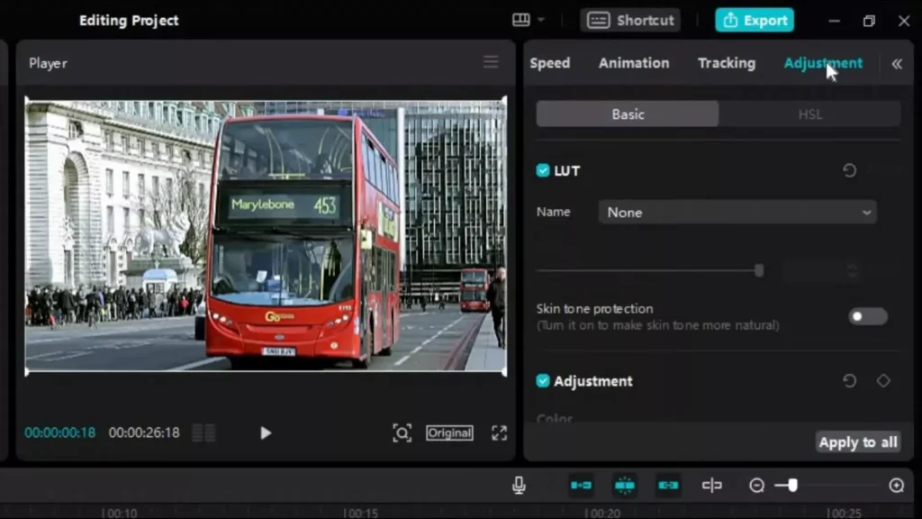
Everything lives here. No hunting menus. Just select and tweak. Makes CapCut a beginner’s dream for color work.
Protecting Skin Tones: Essential First Step for Portrait Footage
People shots? Turn on skin tone protection. It’s a toggle in the adjustment menu. This keeps faces natural while you fix the rest.
Why bother? Harsh changes wash out skin fast. Like makeup gone wrong.
This feature locks in realism. Test it on a talking-head video—you’ll see smiles look real, not orange.
Section 2: Foundational Color Correction Adjustments
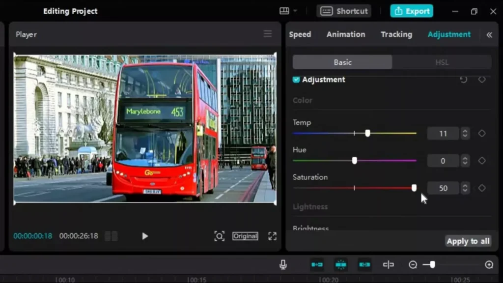
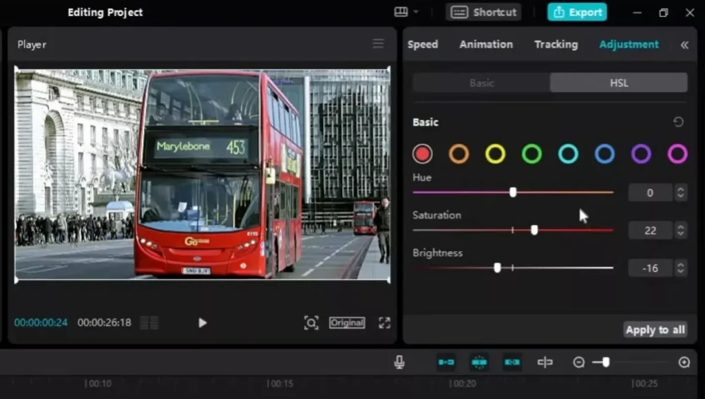
Temperature, Hue, and Saturation Fine-Tuning
Start with basics: temperature, hue, saturation. Temperature shifts warm (orange) or cool (blue). Hue slides colors around the wheel. Saturation pumps up or dials down vibrance.

Play with sliders till it feels right. Too yellow? Cool it down. Flat greens? Boost saturation a tad. Small moves make big differences—like tuning a guitar string.
Watch the preview. Before-and-after toggle shows changes live. Aim for balance that matches your story’s vibe.
Mastering Luminosity: Brightness, Contrast, and Highlights
Next, luminosity tools fix light issues. Drop brightness on overblown clips. They look harsh otherwise, like staring at the sun.
Bump contrast slightly. It adds punch without crushing shadows. Highlights tame bright spots—key for outdoor shots. Pull them back until details pop again.

- Step 1: Eyeball the clip. Too bright overall?
- Step 2: Lower brightness first.
- Step 3: Add contrast. Check shadows.
- Step 4: Tweak highlights last.
Practice on a sunny beach video. You’ll nail even exposure quick.
Introducing Stylistic Effects: Sharpening and Vignetting
Head to effects corrections. Sharpen crisps edges without noise. Great for soft phone footage.
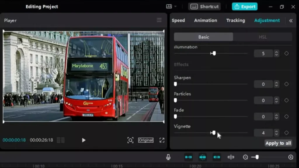
Vignette darkens edges, pulls eyes to center. Like a frame on a photo. Use light for subtle focus.
Preview before/after. Apply both for polish. But don’t overdo—sharp teeth don’t bite.
Section 3: Applying and Managing Color Corrections Efficiently
The “Apply to All Clips” Feature for Consistency
Want uniform looks? Hit “Apply to All Clips.” One click spreads your tweaks across the project.
Perfect for vlogs or montages. No copy-paste hassle. Keeps style tight from start to end.
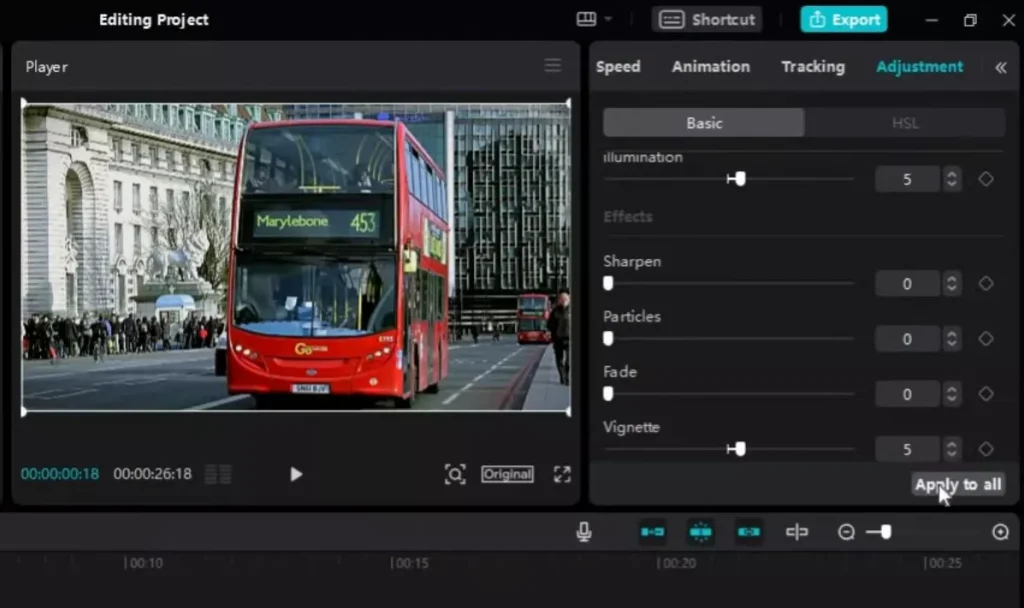
Test on a multi-clip sequence. Instant pro cohesion.
Selective Color Intensity Modification
Dig deeper with color intensity tweaks. Pick a hue, like blues, and dial its strength.
Boost skies without touching skin. Or mute reds in sunsets. Fine control for moods.
Example: Wedding vid with too-pink cheeks? Target and soften just that range. Magic.
Undoing and Resetting Edits for Iterative Improvement
Made a mess? Undo button zaps it. Or reset the panel clean.
This frees you to experiment. Try wild changes, then dial back. Builds your eye over time.
Always preview full timeline. One bad clip kills the flow.
Section 4: Utilizing Adjustment Layers for Non-Destructive Editing
The Superiority of Adjustment Layers Over Direct Clip Editing
Direct edits bake changes into clips. Locked in. Adjustment layers sit above, tweak without touching originals.
Why switch? Flexibility. Tweak the layer, fix everything below. Non-destructive means no regrets.
Like editing a photo in layers—peel back anytime. Safer for big projects.
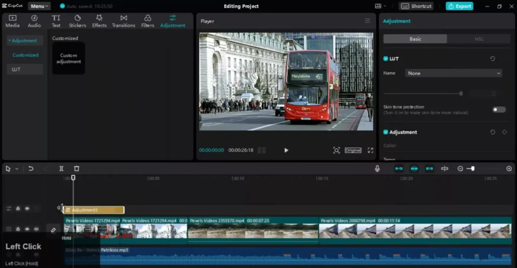
Creating and Positioning the Adjustment Layer in CapCut
Find it in the adjustment menu. Click “Create Adjustment Layer.” Drag to cover your clips.
Apply colors same as before: temp, brightness, all that. Layer grabs them.
Position matters. Stretch to end where you want effects to stop. Precise control.
Quick steps:
- Select timeline spot.
- Create layer.
- Tweak settings.
- Trim length.
Defining the Scope of Layered Effects
Layers only hit footage underneath. End the layer? Effects stop cold.

Great for transitions. Color one scene blue, next warm. No bleed.
Shorten for tests. Expand for full vids. Master this, own your edits.
Understanding the Difference: Color Correction vs. Color Grading
Before sliding any controls, it’s important to understand what you’re actually doing.
Color correction fixes problems.
Color grading creates style.
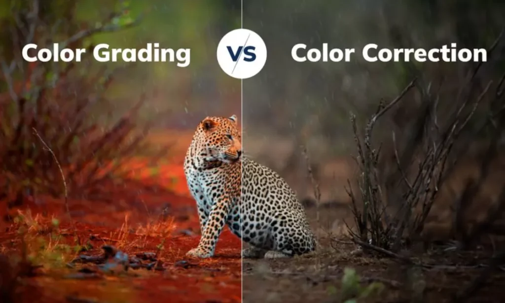
Think of correction as repairing the foundation. Grading is decorating the house.
Color Correction = Technical Fixes
- Adjust white balance
- Fix exposure issues
- Balance highlights and shadows
- Correct unnatural skin tones
If your clip looks too blue, blown out, or flat, that’s correction work.
Color Grading = Creative Styling
- Creating a warm cinematic mood
- Designing a cool, tense atmosphere
- Making colors richer or more muted
- Building a consistent visual identity
Always correct first. Grade second.
Trying to add style before fixing exposure is like putting a filter on a dirty lens.
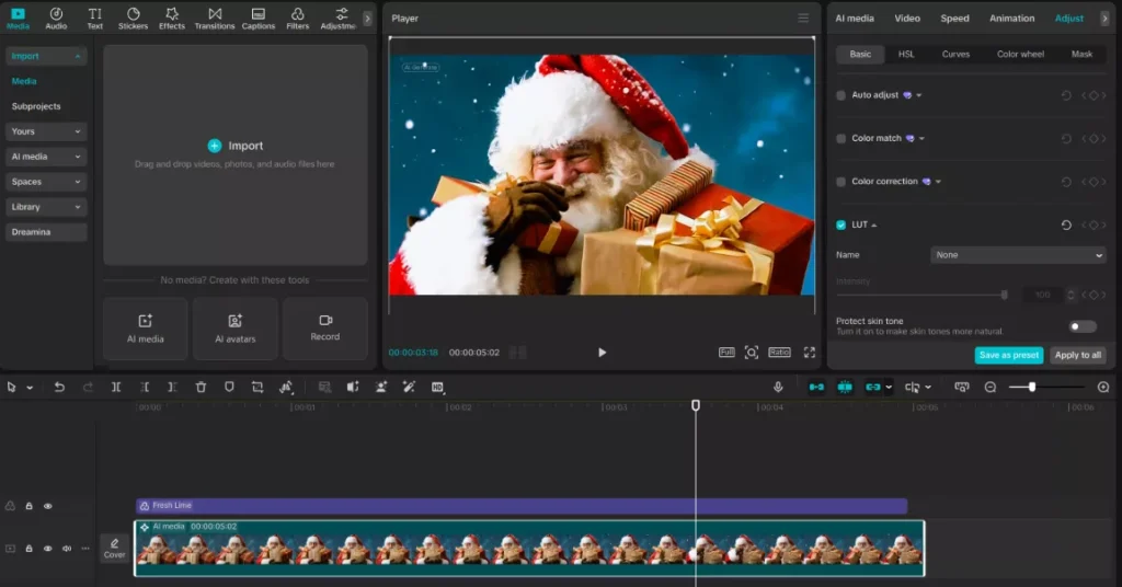
Using LUTs in CapCut
LUTs (Look-Up Tables) are pre-built color grading presets that instantly change the look of your footage.
In CapCut, you can:
- Select your clip or adjustment layer
- Navigate to the LUT section
- Import or choose a built-in LUT
- Adjust intensity for subtle control
When to Use LUTs
- To speed up your workflow
- To maintain brand consistency
- When you want a cinematic base look
When NOT to Rely Only on LUTs
- If exposure is incorrect
- If white balance is off
- If skin tones look unnatural
Pro tip: Lower LUT intensity to 50–70% for a more natural result. Heavy LUTs often destroy highlights and oversaturate skin.
Matching Colors Between Clips
Different clips rarely match perfectly. Lighting shifts. Cameras vary. Even auto settings change mid-shoot.
Here’s a simple matching workflow:
Step 1: Choose a Reference Clip
Pick the best-looking shot in your sequence. This becomes your visual anchor.
Step 2: Correct Exposure First
Match brightness and contrast before touching color.
Step 3: Adjust Temperature
If one clip looks warmer, cool it slightly until skin tones align.
Step 4: Fine-Tune Saturation
Match overall vibrance without overshooting.
Step 5: Compare Side-by-Side
Toggle between clips quickly to check consistency.
If you want fast consistency, use “Apply to All Clips,” then fine-tune individual shots afterward.
This is essential for:
- Interviews
- Multi-angle scenes
- Travel montages
- Event videos
Creating Cinematic Looks (Practical Recipes)
Here are plug-and-play looks you can recreate quickly.
Cinematic Warm Look
Perfect for storytelling, weddings, lifestyle content.
- Slightly increase temperature
- Lower highlights
- Lift shadows gently
- Add subtle contrast
- Apply a light vignette
Result: Cozy, professional, emotional tone.
Moody Blue Look
Great for dramatic scenes or night footage.
- Cool down temperature
- Reduce overall saturation slightly
- Increase contrast
- Boost blues selectively
- Lower brightness slightly
Result: Tense, atmospheric mood.
Bright YouTube Vlog Look
Ideal for talking-head or daily content.
- Boost exposure slightly
- Add moderate contrast
- Increase saturation carefully
- Apply gentle sharpening
- Protect skin tones
Result: Clean, energetic, engaging look.
Read Also: How to Recreate Lemmino’s Cinematic Video Style in CapCut
Common Color Grading Mistakes to Avoid
Even small mistakes can ruin good footage.
Over-Saturation
Cranked colors look unnatural fast. Skin turns orange. Greens glow neon. Subtlety wins.
Crushing Blacks
Too much contrast removes detail in shadows. Always check dark areas.
Blown Highlights
If skies are pure white, detail is gone. Reduce highlights early.
Over-Sharpening
Too much sharpening creates noise and halos around edges.
Ignoring Skin Tones
Faces are the first thing viewers notice. Always protect and check them.
Not Previewing Full Timeline
One mismatched clip can break immersion.
Professional editing is about balance, not extremes.
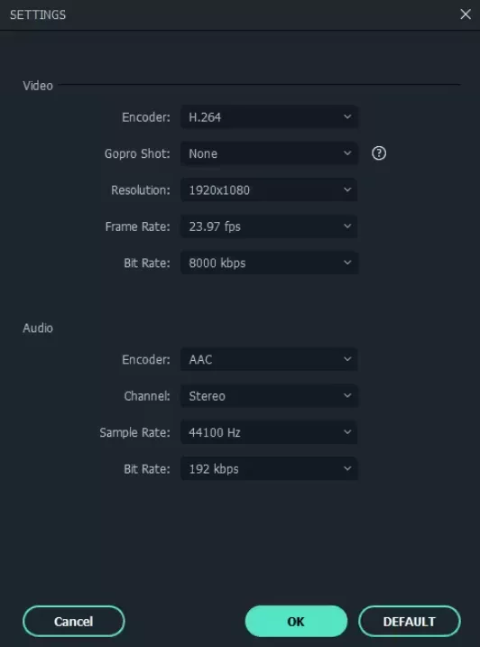
Export Settings for Best Color Quality
You can grade perfectly and still ruin everything during export.
Here’s how to protect your colors:
Resolution
Export at the highest resolution your project was shot in (1080p minimum, 4K if possible).
Bitrate
Choose high bitrate settings to prevent color banding and compression artifacts.
Platform Optimization
- YouTube: High bitrate, 4K upload recommended for best compression results
- Instagram/TikTok: Ensure proper aspect ratio before export
- Avoid re-compressing videos multiple times
Read Also: CapCut Video Size & Aspect Ratio Calculator (All Platforms)
Final Check
Watch exported footage on:
- Your phone
- A computer monitor
- A TV (if possible)
Colors can look different across screens.
Mobile vs Desktop CapCut Differences
CapCut is powerful on both platforms, but workflows vary.
Desktop Version
- Easier timeline control
- Faster fine adjustments
- Better for complex projects
Mobile Version
- Quick edits on the go
- Simplified interface
- Great for social media creators
On mobile, focus on core adjustments (temperature, brightness, contrast). For advanced layering and matching, desktop offers more control.
CapCut Color Grading Workflow Checklist
Use this quick checklist every time you edit:
- Fix white balance
- Adjust exposure
- Protect skin tones
- Balance contrast
- Refine highlights and shadows
- Adjust saturation carefully
- Add stylistic grading
- Match clips
- Use adjustment layers for flexibility
- Preview full timeline
- Export with correct settings
Follow this process consistently and your edits will look dramatically more professional.
Before-and-After Mini Case Study
Imagine a beach clip shot at noon.
Before:
- Harsh highlights
- Washed-out sky
- Overexposed sand
- Flat colors
After Correction:
- Reduced highlights
- Increased contrast
- Balanced white balance
- Boosted blues slightly
After Grading:
- Warm cinematic temperature
- Subtle vignette
- Slight saturation boost
Result: A professional, cohesive shot that feels intentional — not accidental.
Frequently Asked Questions About Color Grading in CapCut
Is CapCut good for professional color grading?
Yes. While CapCut isn’t as advanced as high-end software like DaVinci Resolve, it offers powerful tools like temperature control, contrast, saturation, highlight/shadow adjustments, LUT support, and adjustment layers. For YouTube, social media, and short films, CapCut is more than capable of delivering professional-looking color correction and grading.
What is the difference between color correction and color grading in CapCut?
Color correction fixes technical problems like bad lighting, white balance, and exposure.
Color grading adds style and mood to your footage.
Always correct first, then grade. Fixing exposure and skin tones creates a clean foundation for creative adjustments.
How do I protect skin tones while color grading?
Use CapCut’s skin tone protection toggle before making major adjustments. Then:
Adjust temperature carefully
Avoid over-saturation
Don’t push reds too far
Check faces frequently while tweaking
Skin tones should look natural and consistent across clips.
Should I use LUTs or manual color grading in CapCut?
Both have benefits.
Use LUTs when:
You want faster workflow
You need consistent brand visuals
You want a cinematic base look
Use manual grading when:
Lighting conditions vary
Exposure needs correction
Skin tones look off
Best practice: Correct manually first, then apply a LUT at reduced intensity (50–70%).
How can I make my videos look cinematic in CapCut?
To achieve a cinematic look:
Lower highlights slightly
Increase contrast moderately
Add subtle vignette
Warm up (or cool down) temperature
Avoid over-saturation
Cinematic color grading is about subtle contrast and controlled highlights, not extreme effects.
Why do my colors look different after exporting?
This usually happens because of:
Low bitrate export settings
Platform compression (YouTube, TikTok, Instagram)
Viewing on different screens
Always export at high quality and preview on multiple devices before publishing.
How do I match colors between different clips?
Follow this order:
Match exposure (brightness and contrast)
Match white balance (temperature and tint)
Match saturation
Compare clips back-to-back
You can also use “Apply to All Clips” as a base, then fine-tune individual shots.
What are the best color grading settings in CapCut?
There’s no universal “best” setting because lighting and scenes vary. However, a safe starting point is:
Slight contrast boost
Reduced highlights
Balanced shadows
Natural saturation
Protected skin tones
Adjust based on the mood you want to create.
Is adjustment layer editing better than editing individual clips?
Yes. Adjustment layers allow non-destructive editing. You can:
Apply changes across multiple clips
Make global tweaks instantly
Remove or modify grading without damaging original footage
This makes your workflow faster and more flexible.
Can I color grade on CapCut mobile?
Yes. CapCut mobile includes essential tools like temperature, brightness, contrast, saturation, and filters. While desktop offers more precision, mobile is fully capable of producing professional results when used carefully.
Conclusion: Building a Color Correction Workflow
Color grading in CapCut boils down to prep, balance, and layers. Protect skin first. Fix exposure next. Use layers for smart control.
These steps turn raw footage pro. Practice on old clips. Watch your skills grow.
Next, import color templates. They speed up workflows big time. Download CapCut Pro now.
Edit a video today. Comment your before/afters—we would love to see.