Premium captions may seem like a small detail, but they make a powerful difference. They grab attention, elevate the overall quality of your videos, and can lead to more views, longer watch time, and even higher-paying clients.
In this step-by-step guide, you will learn how to create viral-ready captions in CapCut—from choosing the right fonts and colors to adding smooth motion and advanced effects like gradients and glow. By the end, you’ll be able to replicate the polished caption styles used by top creators across today’s most popular videos.
Why Viral Captions Matter for Your Videos
Great captions do more than transcribe speech. They guide attention, underline key ideas, and make your edit feel intentional. That polish helps your content stand out in crowded feeds. It also makes your work easier to sell, whether you’re editing shorts for clients or growing your own channel.
Here’s what you’ll build: a clean, centered caption system with mixed fonts, selective color highlights, and smooth animations that feel premium, not noisy. Expect snappy slide-ins, subtle blurs and fades, and a structure that keeps text clear of UI buttons on platforms like Instagram.
Get this right and you’ll see a direct impact: more views, better retention, and higher-paying clients who notice the difference.
The Power of Fonts in Setting the Tone
Fonts carry emotion. Choosing the right style for each word helps you tell a story before anyone reads a letter.
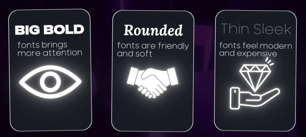
- Big bold fonts: Bring more attention. Use them for key words or short phrases that need punch.
- Rounded fonts: Feel friendly and soft. Great for conversational lines or approachable brand voices.
- Thin, sleek fonts: Feel modern and expensive. Perfect for words like “premium,” “clean,” or “minimal.”
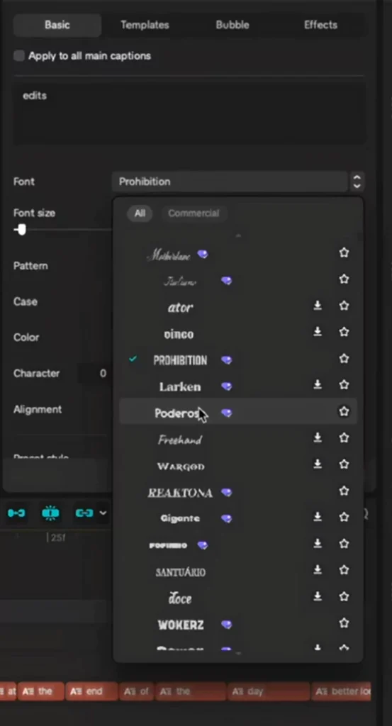
Mix two to three font styles across your captions. For example, pair a thin, modern font with a bold accent font. Then add a third style that’s unusual or expressive to highlight a keyword. Keep readability first and make sure everything still aligns cleanly.
Tip: Capture a few font screenshots in CapCut with labels like “bold,” “rounded,” and “sleek.” Under each, add an italic emotion note, like “friendly” or “expensive,” to guide future choices.
Color Psychology to Evoke Emotions
Color does the heavy lifting. It sets the feel of your captions at a glance.
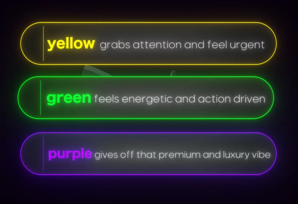
- Yellow: Grabs attention, feels urgent.
- Green: Feels energetic and action-driven.
- Purple: Gives a premium and luxury vibe.
Many editors stop at picking a font and a color. That’s fine for basic captions, but premium captions need motion too. You’ll add that next.
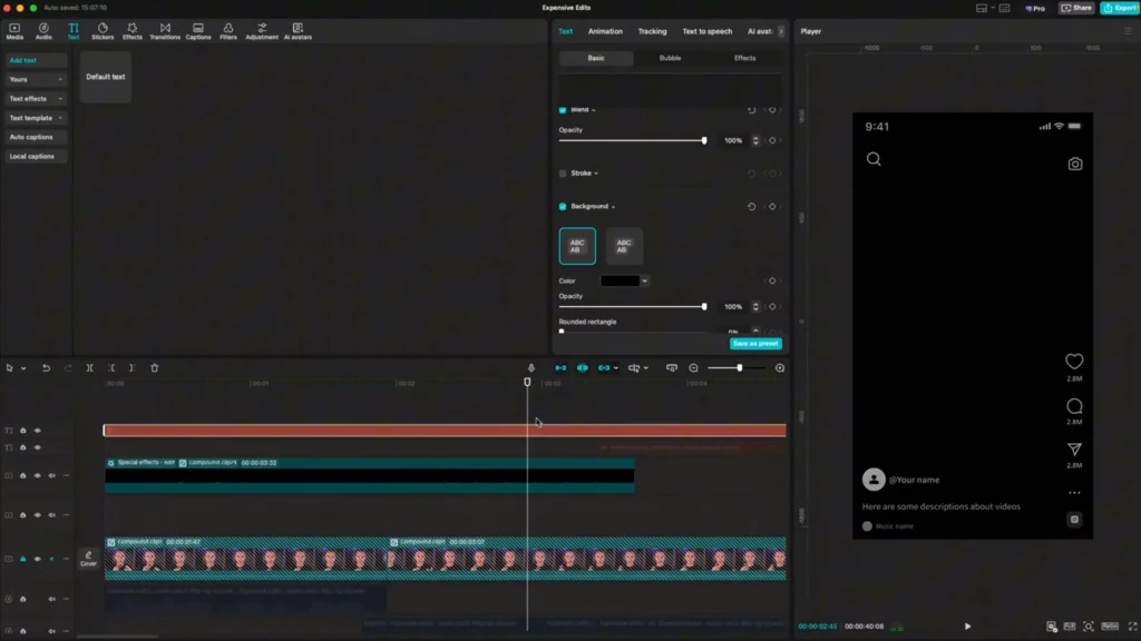
Getting Started: Setting up your CapCut Workspace
A clean setup makes everything faster and more consistent. It also avoids messy alignment and blocked text on social media previews.
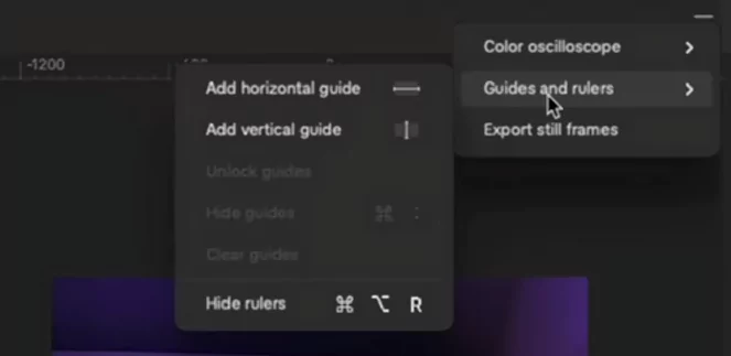
- Add a horizontal and vertical guide to center everything. Use CapCut’s rulers and guides so you can balance your text visually.
- Add another horizontal guide under your chin. This is your baseline for building captions that sit naturally in the frame.
- Lock the guides using the control in the top corner. If you don’t lock them, they’ll move by accident as you place text.
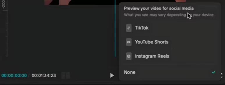
- Turn on the social media preview at the bottom and choose Instagram resolution. This shows UI buttons so your captions don’t hide behind them.
This setup keeps your typography consistent and prevents common layout mistakes. It also speeds up your workflow since you won’t need to realign for every line.
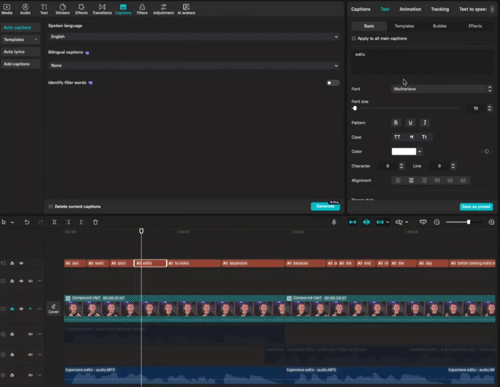
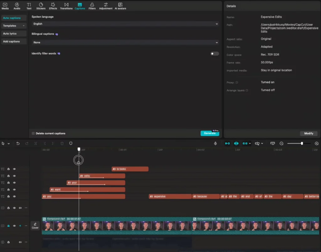
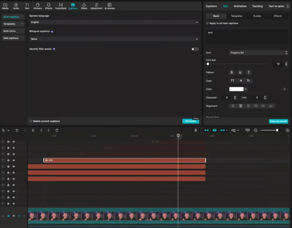
Generating and Preparing Your Captions
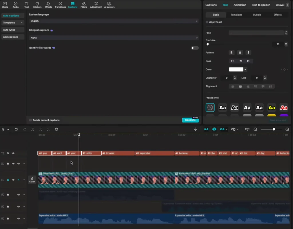
Start with CapCut’s caption tool, then prep your text for granular control.
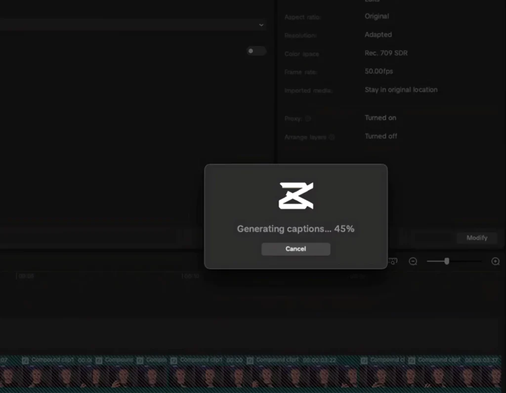
- Generate your captions. Go to the captions panel and click “generate your captions.”
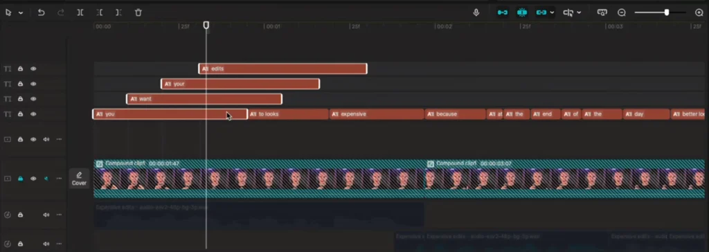
- Split into individual word layers. Click between words and press Enter to break each caption into separate layers.
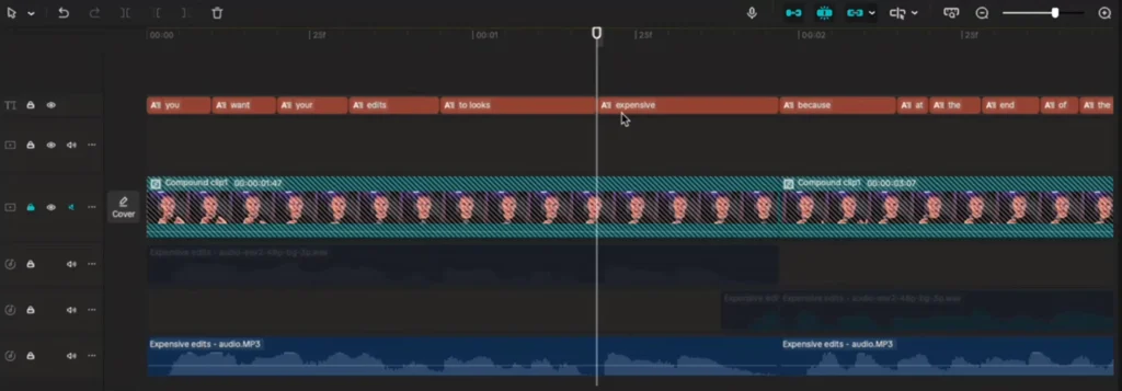
Yes, this takes a bit of time. But once each word sits on its own layer, you can position, scale, color, and animate with total freedom. That’s the difference between “basic” and “premium.”
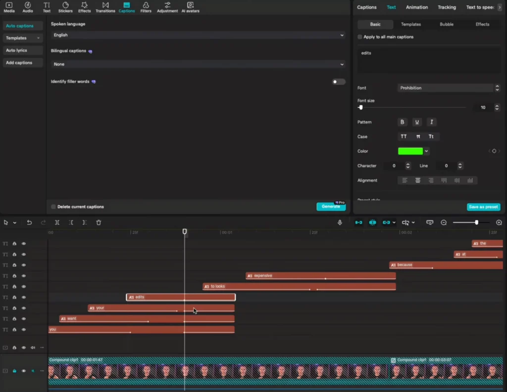
Building Multi-Font Caption Layers
Use a small set of fonts to give your captions texture and hierarchy. Two to three styles is the sweet spot.
Here’s a quick working method that keeps everything tidy:
- Select four text layers you’ll animate together.
- Duplicate and stack them above. On Mac, use Command + click to select, then drag to duplicate. On Windows, hold Alt and drag.
- Cut all to equal length. Press S to trim so each word ends at the same time.
- Deactivate layers you don’t need yet. Press V to toggle visibility, leaving only the first active so you can design with clarity.
Once you have your stack, pick your font for the first line. Thin for the body, bold for the punch word, and a third style for flavor. You’re designing a “system,” not just random choices. Repeat this structure as you move through the script.
Positioning Captions for Perfect Alignment
With the under-chin guide set, start placing words.
- Uncheck “apply to all main captions.” This lets you move each word layer without affecting the rest.
- Drag your first word up to the baseline. Place the second beside it, then the third.
- Select the group and center it. Use CapCut’s alignment tools so the block sits neatly on the vertical guide.
- Adjust scale. Increase the size of important words and shrink less important ones.
Highlight keywords with a different font or color. For example, set “edit” in a thicker font and place it slightly above the main line to draw the eye. Keep spacing consistent so the composition looks deliberate, not random.
Pro tips:
- Make key words slightly larger to create emphasis without shouting.
- Keep the baseline consistent across sentences so your captions feel cohesive.
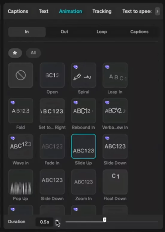
Animating Captions for Premium Motion
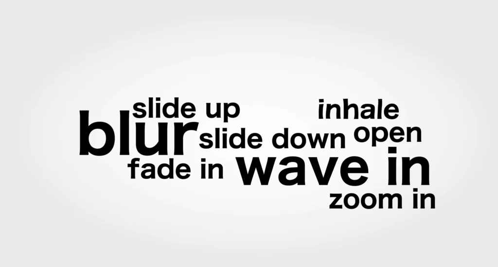
Motion separates premium captions from basic ones. CapCut’s preset library is a mixed bag, so curate a short list of favorites and star them for quick access.
Good presets to start with:
- Slide up, slide down
- Blur in, blur out
- Fade in, fade out
- Wave in
- Zoom in
- Open
- Inhale
Apply clean, minimal motion:
- Select your main three-word stack and set an “in” animation like slide down. Keep the duration around 0.4 to 0.6 seconds for a snappy feel.
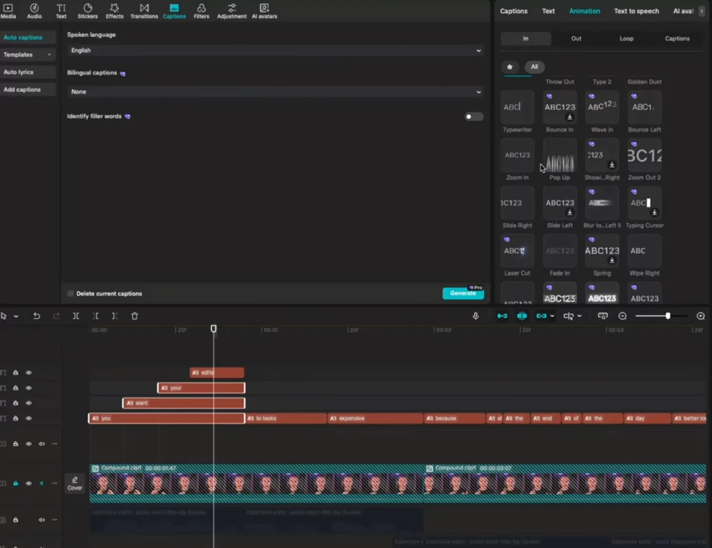
- For a highlighted word, use a different “in” preset, such as set right or a subtle zoom. Stagger its timing by a few frames so it feels intentional.
- For “out,” use blur out or slide down. Extend the layers slightly so the exit animation has time to finish without cutting off.
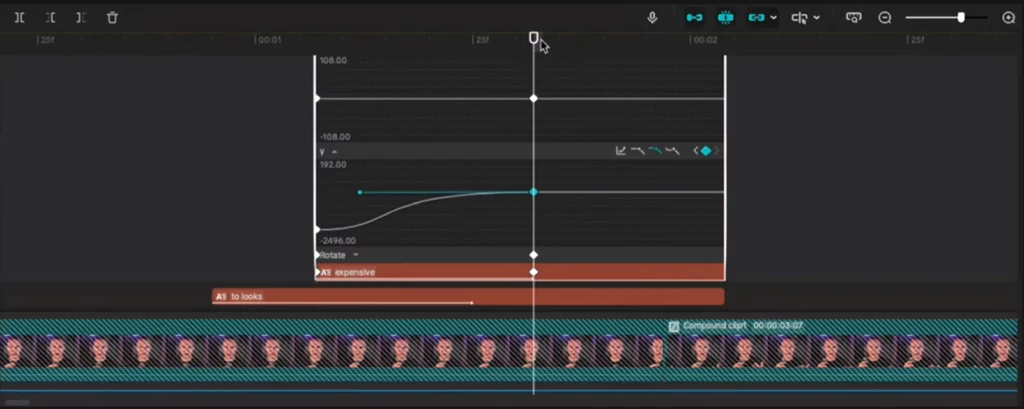
Combine effects for pro-level polish. For example, blur plus slide up:
- Add a blur “in” on the word.
- Open the transform controls and set two position keyframes. One where the blur ends, one at the start.
- Move the first keyframe upward so the word starts higher and slides into place.
- Right-click and show variable speed animations, then apply autocurve to both keyframes for eased motion.
- Adjust the green speed line to ramp fast, then ease slow for a smooth finish.
Common fixes:
- Timing gaps: Extend your layers a bit and overlap animations so there isn’t dead air between lines.
- Messy favorites: Star your best presets now so you don’t hunt later.
- Mismatched exits: Use the same out animation for the group so everything leaves together.
Example sequence you can build:
- First caption: three words slide down in, highlight word pops from the right, all blur out together.
- Second caption: words slide up at 0.6 seconds, accent word waves in, entire group slides down to exit.
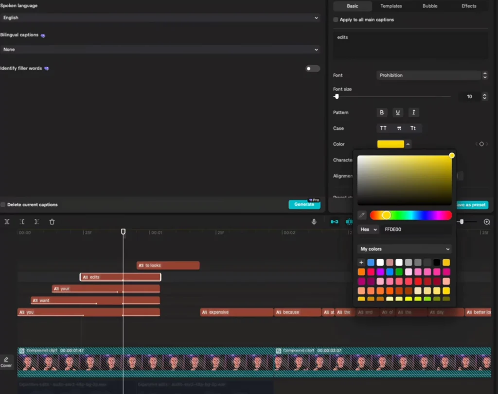
Highlighting Key Words for Impact
Use color and font to make key ideas pop. Keep it simple and consistent.
- Choose a bright highlight: yellow, neon green, purple, or a blue accent.
- Change the highlight word’s font to match the meaning. A luxurious word like “expensive” looks better in a sleek, refined typeface.
- Offset the highlight slightly above or beside the main text for extra focus, but keep alignment clean.
Strong highlights guide the viewer’s eye and make your message easier to scan.
Advanced Effects: Gradients and Glows
Once your motion and layout are set, add tasteful effects to push it over the top. Two quick wins are gradient text and a soft glow background to make captions stand out over footage.
Creating Gradient Text Quickly
You can build a smooth gradient without leaving CapCut.
- Duplicate your text layer.
- Change the second layer’s color, such as dark green.
- Right-click each layer and create a compound clip.
- Open Video, then Mask, and choose Split on the top compound. Drag the split, then increase feather for a soft blend.
- Select both compounds and create a new compound clip to keep your timeline clean.
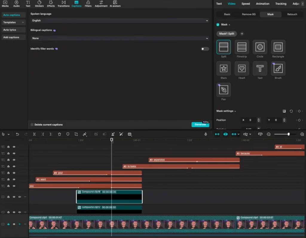
The result is a gradient that reads clean and feels premium.
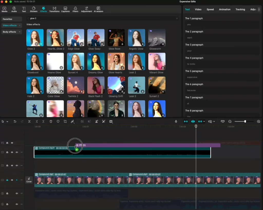
Adding Glow and Pop Effects
For extra separation and a subtle glow:
- Select all your caption layers, create a compound clip, then add a glow effect from the Effects panel. Keep it light so the text stays legible.
- To add a soft background bar:
- Add a default text layer, delete the text, and max the font size.
- In the text settings, enable a black background with proper padding.
- Create a compound clip.
- Go to Video, then Mask, choose Split, rotate and position it behind your captions, and raise feather for softness.
- In Basics, set this to layer 2 so your captions sit above it on layer 1.
This creates a subtle band that boosts contrast, especially over busy footage.
Pro Assets and Next Steps
If you want a head start, consider using ready-made assets to speed up your workflow. Motion graphics, backgrounds, sound effects, overlays, and transitions help you hit a premium look faster. Check out these Video editing assets for CapCut.
Keep practicing. The goal isn’t to copy a single layout. Your clients and videos will vary, so split words, position them with intent, and test different motion combos. Over time you’ll build instincts for timing, scale, and emphasis that fit any script.
Suggested assets to build your toolkit:
- Motion graphics for intros and accents
- Backgrounds for texture behind captions
- Sound effects for subtle punch on in and out animations
If you want to push even further, explore building After Effects-style results right inside CapCut, including shine effects, custom backgrounds, and more advanced gradients.
Conclusion
Premium captions follow a simple recipe: thoughtful fonts, smart color choices, clean alignment, and tasteful motion. Add gradients and glow when they serve the story, not just for flash.
Start with a solid workspace, split every word for control, and keep your favorite animations close. Then refine timing until nothing feels random. Do this consistently and you’ll upgrade your edits, earn more views, and attract higher-paying clients who notice the details.
Ready to try it on your next project?